Visualize intelligence
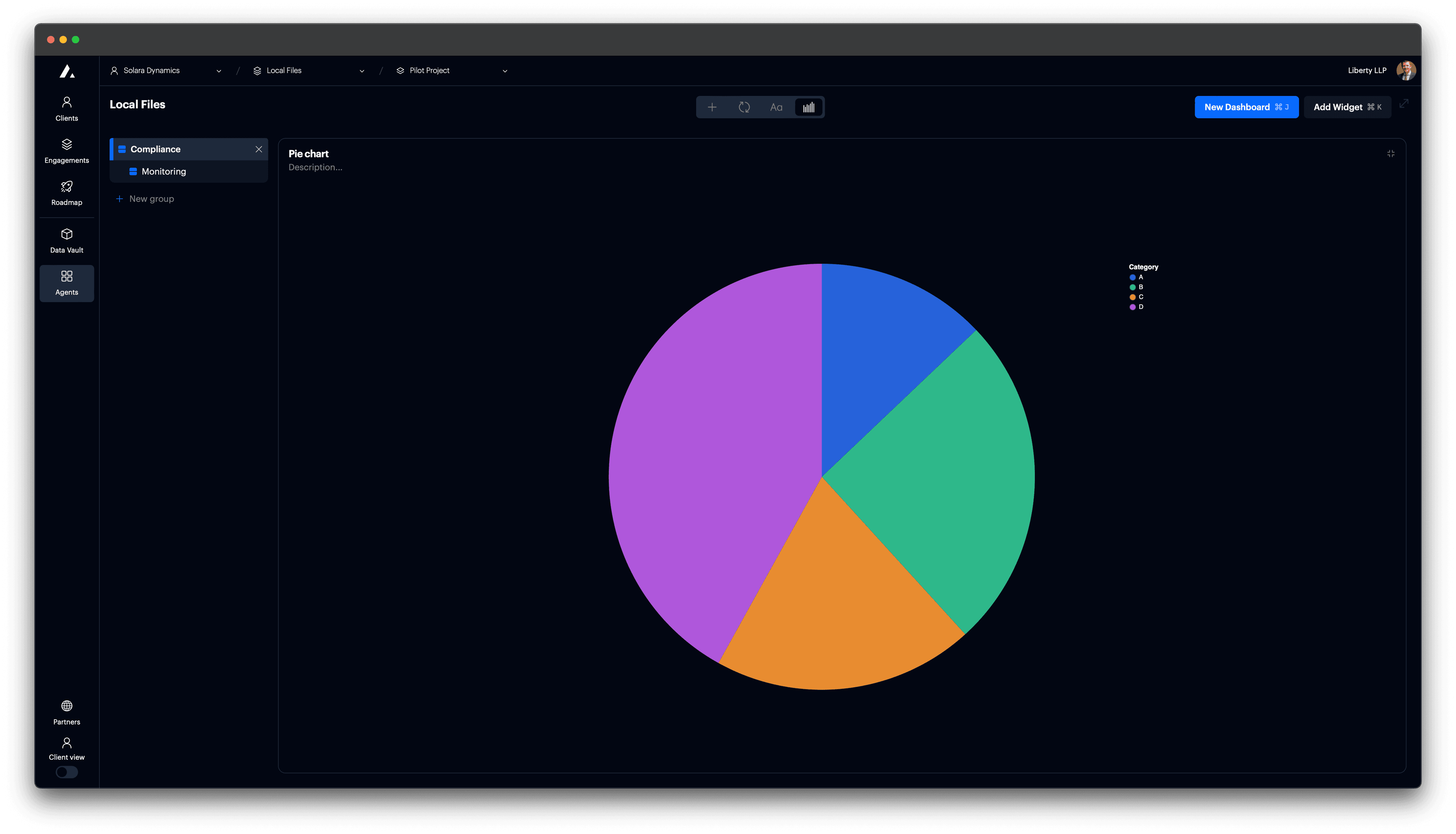
Pie chart
Add a pie chart to a card.
Pie charts are useful for showing proportions between categories in a single measure. Use them to display part-to-whole relationships when there are few categories.
Add pie chart
Set card to type "Vega Chart".

t0 Prompt
Select data in the context dropdown of the chat window.
make a pie chart
generate arc chart
convert to pie chart
Code
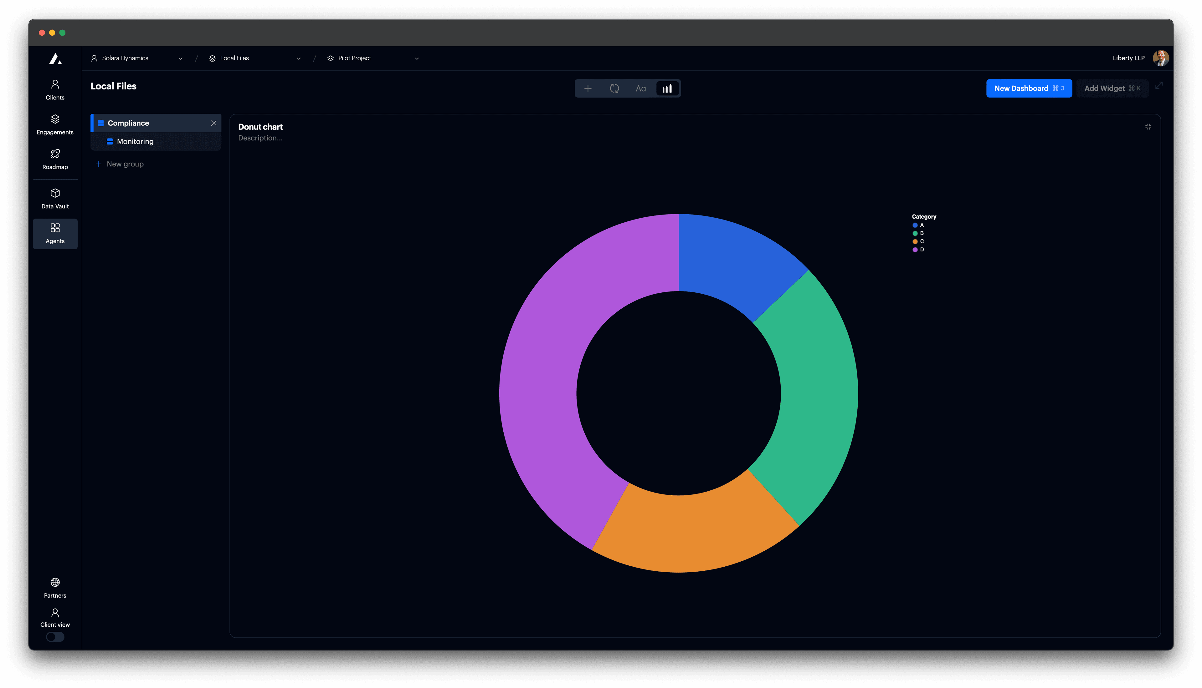
Add donut chart
Use a donut chart to highlight proportional values while drawing attention to the center. This is useful when you want a visual distinction or need to place a label or value in the middle.
t0 Prompt
make a donut chart
convert to donut chart
Code
Configuration options
| Property | Description |
|---|---|
theta | Defines slice size using a quantitative field. |
color | Maps categorical values to color. |
tooltip | Displays values on hover. |
detail | Preserves group granularity for cleaner visual segmentation. |
innerRadius | Controls the inner radius of the arc in pixels; use to create a donut chart. |
outerRadius | Optional. Sets the outer radius of the arc in pixels. Defaults to chart size. |
radius | Relative size (0 to 1) of the arc radius; useful for responsive design. |
view.stroke | Hides or shows the chart outline. Use null to remove the border. |
autosize | Controls how the chart fits its container. Recommended: {"type": "fit"}. |