Visualize intelligence
Scatter plot
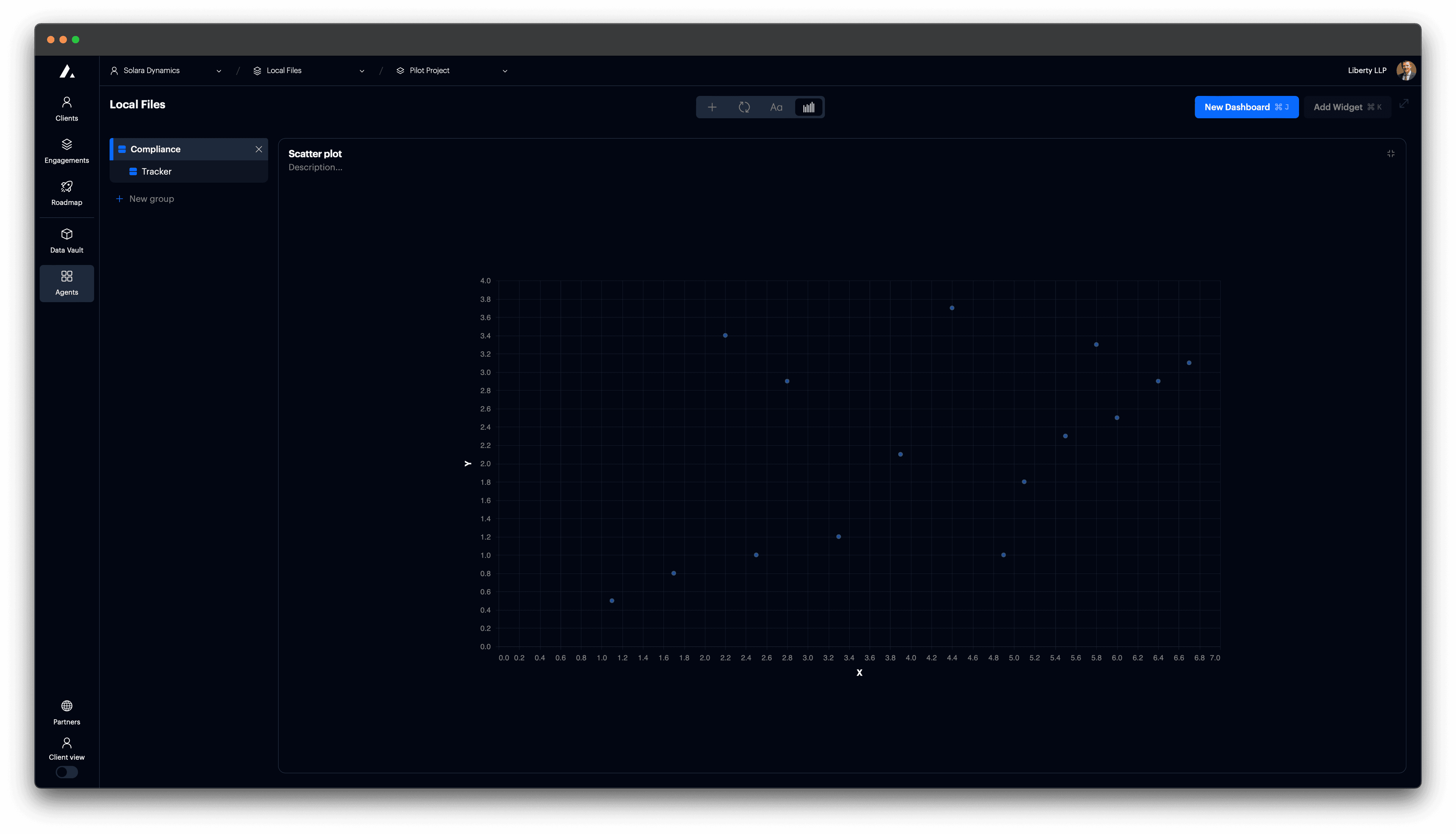
Add a scatter plot to a card.
Scatter plots are useful for showing relationships or distributions between two quantitative variables. Use them to spot clusters, trends, or outliers in numerical data.
Add scatter plot
Set card to type "Vega Chart".

t0 Prompt
Select data in the context dropdown of the chat window.
make a scatter plot
show x vs y
create dot plot
Code
Configuration options
| Property | Description |
|---|---|
x | Sets horizontal position using a quantitative field. |
y | Sets vertical position using a quantitative field. |
mark | Use "point" to show data as dots. |
tooltip | Displays values on hover. |
size | (Optional) Encodes point size using a quantitative field. |
color | (Optional) Distinguishes groups by category or value. |
shape | (Optional) Varies point shape by category. |
view.stroke | Removes outer chart stroke. |
autosize | Ensures the chart fits inside its container. |